Inductee No. 010 First ballot
Nothing
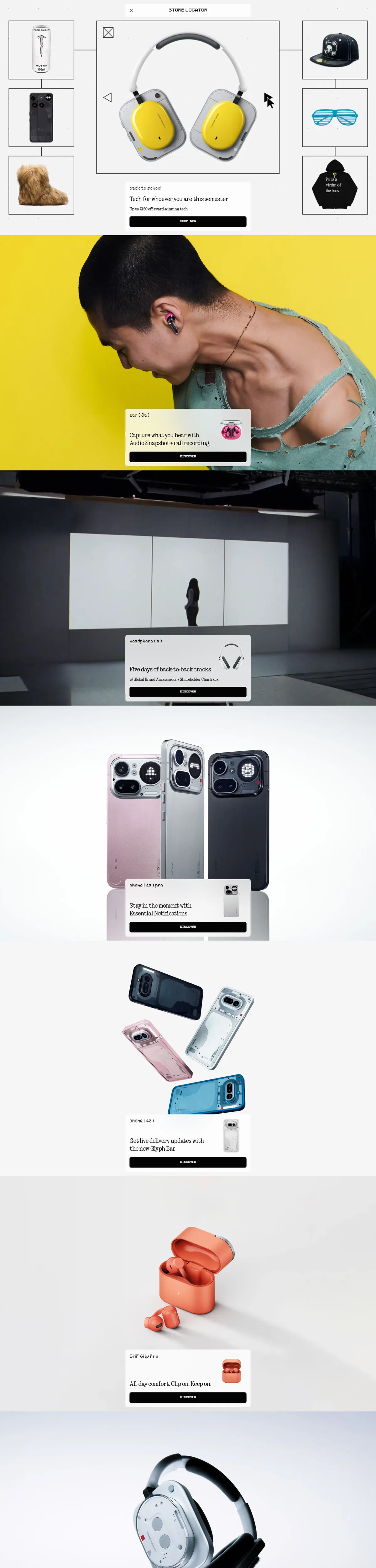
The London gadget maker's storefront treats every scroll like a product reveal: one device per screen, dot-matrix captions, transparent hardware photographed like jewelry. Consumer tech merchandised with gallery pacing.
Visit nothing.techThe citation
Each section is a single held shot — yellow-ground headphones on a shaved head, Phone (4a) units fanned out in pink and clear, an open earbud case in tangerine — with a small dot-matrix caption card floating over it: model name, one promise, one button. The rhythm never breaks. By the time the OS section arrives in glitch-gradient pastels, the page has taught you its cadence and cashes it in.
The vote is for merchandising as art direction. Nothing sells transparency as a literal design feature, and the site’s restraint — acres of negative space, monospaced type, product photography that treats circuit boards like watch movements — makes the hardware look inevitable. The footer stacks its links in the same dotted letterforms as the phones’ glyph lights. Coherence from silicon to CSS is what banners are for.
The colorway
Five swatches pulled straight from the screenshot. Each pennant leads to its colorway.
Filed under
The mark, for Nothing
Fly it on Nothing if you like — it points visitors back to this plaque. The banner stays up either way.

<a href="https://earnthewall.com/inducted/nothing">
  <img src="https://earnthewall.com/badge.svg"
       alt="Earned the wall" width="176" height="40">
</a>