Inductee No. 007
The Verge
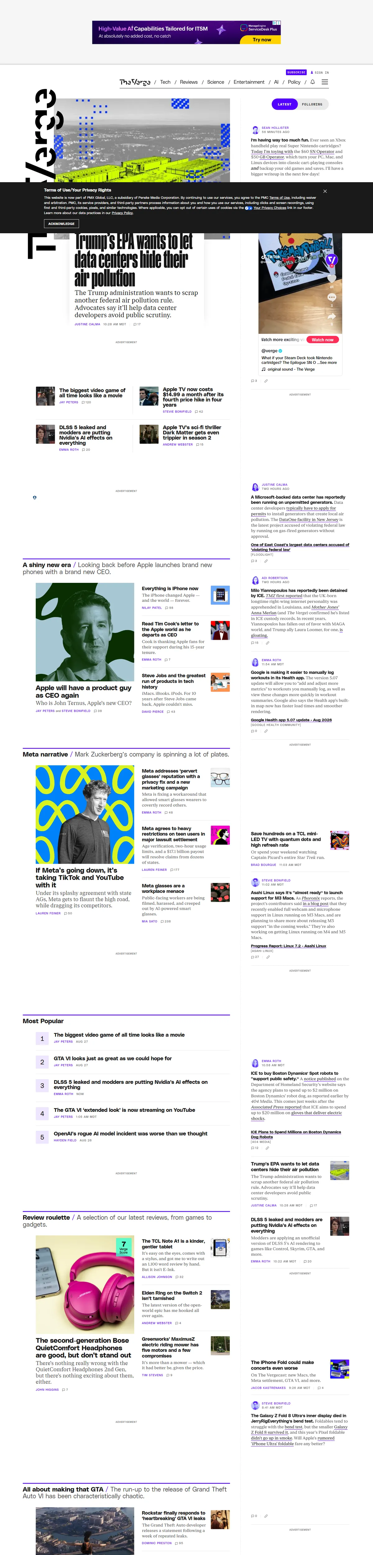
Tech journalism's loudest masthead: electric purple, clashing patterns, and a homepage that mixes lead stories with a live feed of quick posts. A redesign that bet a major publication could feel like a group chat, and won.
Visit theverge.comThe citation
The nameplate runs sideways down the rail, the accent colors ignore every best-practice palette, and pattern blocks crash between headlines like station idents. It should be chaos. It reads instead as energy under editorial control: the lead story holds the top, features get art direction, and the right-hand column streams short posts with bylines and timestamps — the site talking to its readers between the big stories.
The wall votes it in for having a temperament. Most news fronts are interchangeable gray grids terrified of personality; this one is instantly identifiable at thumbnail size and structured enough to navigate at full size. The purple is a masthead you can hum. Publishing design that swings this hard and still lands the news is rare enough to enshrine.
The colorway
Five swatches pulled straight from the screenshot. Each pennant leads to its colorway.
Filed under
The mark, for The Verge
Fly it on The Verge if you like — it points visitors back to this plaque. The banner stays up either way.

<a href="https://earnthewall.com/inducted/theverge">
  <img src="https://earnthewall.com/badge.svg"
       alt="Earned the wall" width="176" height="40">
</a>