Inductee No. 011
Wealthsimple
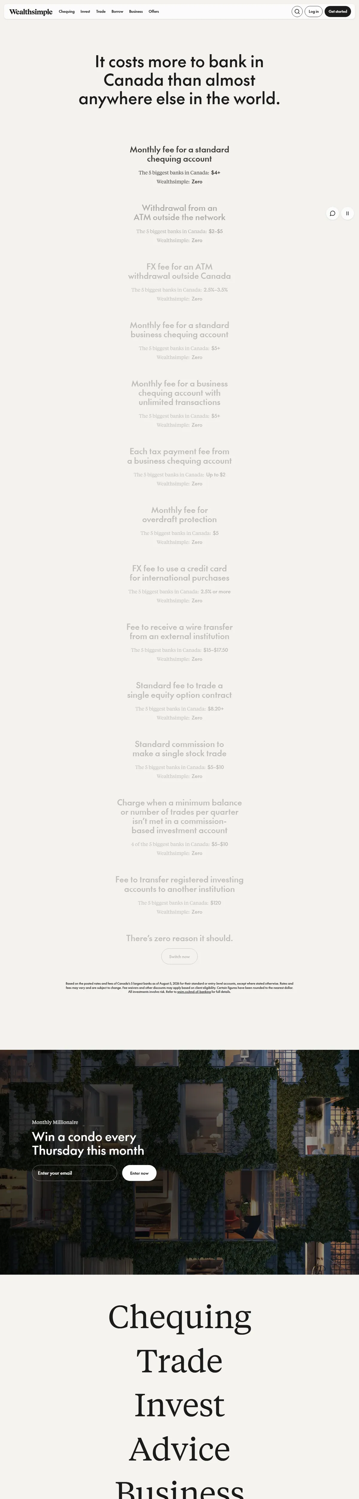
Canada's money app argues its case in giant serif type: an itemized list of every fee the big banks charge, then four words — chequing, trade, invest, advice — set like a poem. Finance marketing with a literary spine.
Visit wealthsimple.comThe citation
The opening move is an indictment: “It costs more to bank in Canada than almost anywhere else in the world,” followed by a receipt-length list of the incumbent banks’ fees, each one priced, each matched against Wealthsimple’s zero. Then the products arrive as single serif words at display size — Chequing, Trade, Invest, Advice, Business — before a phone and a black metal card get their glamour shots against night skylines.
What earns the spot is the register. Fintech sites usually oscillate between crypto-bro neon and insurance-brochure beige; this one reads like a well-argued essay with money-green restraint, art plates of colored glass and alpine light breaking up the argument. “Welcome to the future of money” is set like a chapter heading, not a slogan. Four million Canadians get told the truth in Tiempos, and it converts.
The colorway
Five swatches pulled straight from the screenshot. Each pennant leads to its colorway.
Filed under
The mark, for Wealthsimple
Fly it on Wealthsimple if you like — it points visitors back to this plaque. The banner stays up either way.

<a href="https://earnthewall.com/inducted/wealthsimple">
  <img src="https://earnthewall.com/badge.svg"
       alt="Earned the wall" width="176" height="40">
</a>